BRAND DESIGNER · NEW YORK
Pasta Teatro
ART DIRECTION · BRAND IDENTITY
Pasta Teatro is a contemporary Italian pastificio in the heart of Paris, built around an open pasta workshop in full view of the street where the kitchen is the stage and every plate a performance.

ACT I
A name that sets the stage
Pasta Teatro opens on Boulevard Saint-Michel as a modern Italian pastificio; fresh pasta made in an open workshop, in full view of the street. The name carries its own brief: the kitchen as a stage, every plate a performance.
ACT II
Theatre, without the costume
The risk with a name like this is cliché - checked tablecloths, folkloric trattoria, theatrical excess. The challenge was to keep the drama and the Italian warmth while staying modern, premium, and quietly restrained.
ACT III
Identity as stagecraft
The identity treats brand as theatre: editorial typography composed like an opera programme, a warm and controlled palette, and discreet theatrical cues used as ornament, never as decoration.


The logotype answers the brief's guiding reference: old opera posters. It is set in an editorial serif with pronounced, bracketed serifs and composed like the title on a vintage playbill: generous spacing, a clear hierarchy, and a sense of drama carried by the type itself rather than by ornament.
The central "T" is treated as the focal letter, a small nod to the stage at the heart of the name.
The logotype comes in two lockups: a horizontal version for the site, menu, and signage, and a vertical version for narrow or centred formats, so the name holds with equal confidence on a storefront sign and on a delivery box.
The brand on the stage

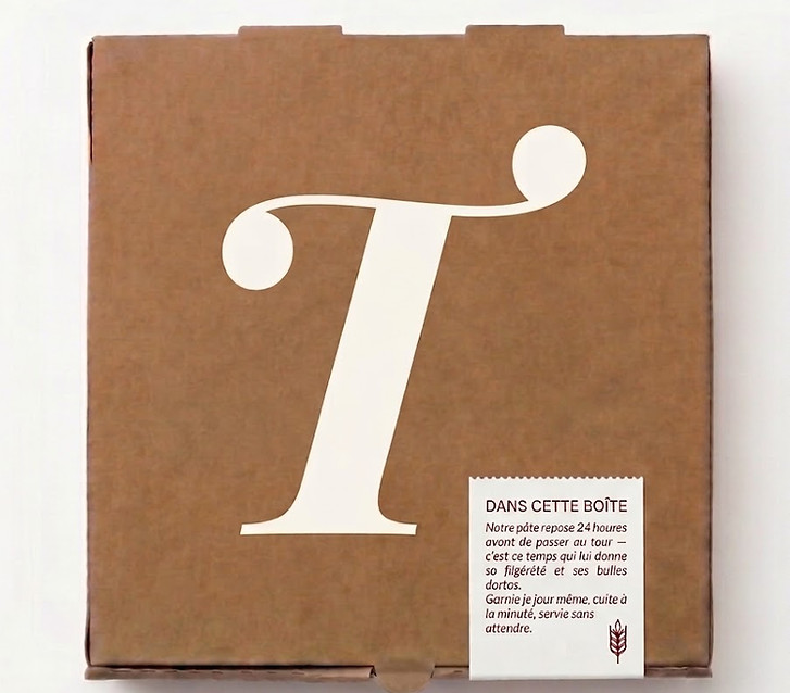


Off the page, the identity becomes a working system. The same logic — type staged like a programme, velvet red as the signature, brass kept for the finest detail — carries from the storefront sign to the printed menu, the business cards, the chef's apron, and a kraft delivery box stamped by hand. Each touchpoint plays its part; together they let the brand feel like a single, continuous performance.