BRAND DESIGNER · NEW YORK
Packaging
PACKAGING DESIGN · BRAND IDENTITY · ILLUSTRATION
Maison Manifacier is a French skincare brand founded by Marine.
Her approach combines herbalism, olfactology and what she calls soins-souvenirs, treatments built around scent, memory and emotion. All the products are organic and made in France, and the brand was recognized at the Victoires de la Beauté 2025.

Context
Maison Manifacier already had a brand identity when Marine asked me to work on her new collection.
My role was to extend the brand's existing voice into a full product universe, one that could hold its own next to larger skincare names while keeping the personal, almost intimate quality of her practice.
Birds have always been a meaningful presence in Marine's life. They kept coming up in our early conversations, and it quickly felt right to let them carry the collection. For a brand built on memory and sensation, a decorative nature motif would have been too easy. Birds had real weight, they belonged to her story.
Each product is paired with a specific bird, illustrated by hand in a style that nods to old natural history plates.

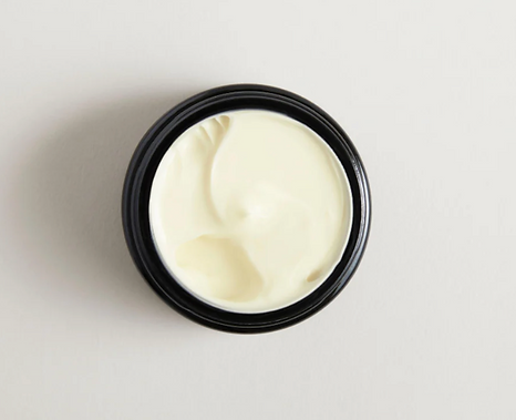
The System and Packaging
I designed the visual system for the collection. Packaging architecture, typography, illustrations and the label design across the full range.
The typography pairs a refined serif with a simple sans-serif, to balance craft and everyday usability.
The palette stays on soft neutrals, so the illustrations and the black glass bottles can really carry the character of the brand.


